MOTION
I do most of my titles in Motion, because it has a better text resolution output. All the titles for the Camping video were designed in Motion and animated in Motion using a couple of presets. I didn’t do anything really complicated.
BLUE SWIRLY
The blue and yellow swirly thing that “revealed” the number for each point, was a free download from Digital Juice and is part of their Motion Design Elements Library - "Logo Revealer's."
SPECIAL EFFECTS
COLOR CORRECTION
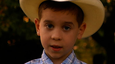
I briefly touched on this in my last BTS, and I don’t have a lot more to add. One benefit I have found is to use a proper “production monitor” when doing color correction. These monitors can be rather expensive and range from around 7” to 13” in screen size. I bought an 8” JVC model off of ebay for under $200. My computer screen is VERY noticeably darker and different in color than my external monitor. A monitor isn’t a must, but if you plan on doing any serious CC work, especially if your finished movie will be viewed on DVD (thereby often using a TV screen) and/or your movie will be projected on a screen using a projector, I highly recommend some extra thought and care when doing the color correction. Most of the CC for this project isn’t very noticeable, and I hard a time finding a cilp that would show the differences very well. Because I shot at sunset and I shot on a couple of different days, some shots were warmer than others and I decided to CC to make all the narration clips a warm orange color……
Before

After
SPECIAL FX
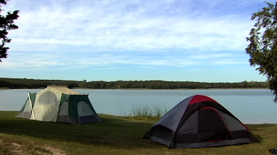
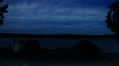
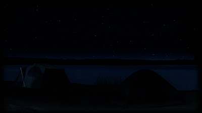
Since my camera doesn’t do well when shooting at night, meaning the video doesn’t show up very well….the “night shot” is really the only shot with special FX applied, but I liked it so much I just had to tell you about it. Here are the stages I went through….
Original shot
Color Corrected using Magic Bullet Editor's "Night" preset, with a few custom tweaks :)
I then added several layers of stars that I created in Blender, and used the compositing option in FC to help them blend into the shot better. It isn’t perfect, but I was pretty pleased with the result.
[CLEANING UP THE EDIT FLOOR] coming next….


1 comment:
Thanks for the editing info, it is looking great!
Post a Comment